KST Marketing Technical Guide
How to design for print
At KST Marketing we like to give you as much choice as possible. We have a team of designers ready to design anything you desire, ready made templates that you can tweak, or you can upload you own artwork for print.
However, the latter can be a bit daunting if you are new to designing for print, so this comprehensive guide should help to ensure your project is correctly set up for print.
How to setup your file?
There are several things you’ll need to consider when initially setting your file up, this practical guide will walk you through the main processes. No matter whether you’re designing a business card, flyer, booklet, banner or any other printed material from KST Marketing we`ll help guide you in the right direction.
Templates – We have provided templates, in various file formats for all our products which can be accessed via the product pages templates. These templates will ensure your design is the correct size and proportion
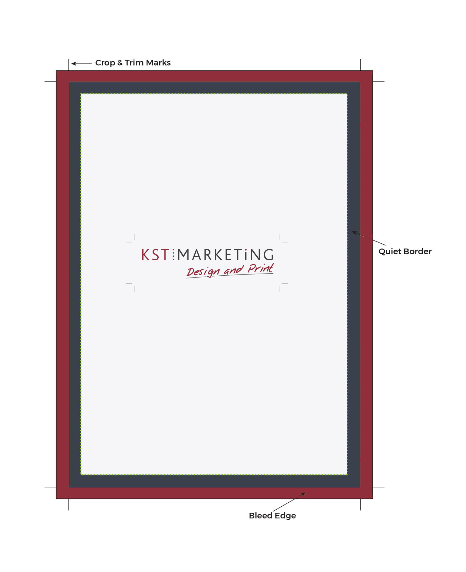
Bleed – Bleed is an area added to the edge of your artwork which includes any blocks of colour or background design which reaches the edge of the page. To create a bleed, simply extend your image, colour or text 3mm over the edge of the page, alternatively, you can use the bleed settings within your design software to add bleed automatically to your PDF. Failure to add bleed may result in a white border round your business card, flyer etc.
Margin / Quiet Border – This is the area round the edges of your artwork which does not contain text, images or logos (unless they bleed off the edge.) We recommend at least 3mm, but preferably 5mm, from the trimmed edge of your artwork. Not only will this avoid any printing errors, but it also makes your design look neater and more balanced.
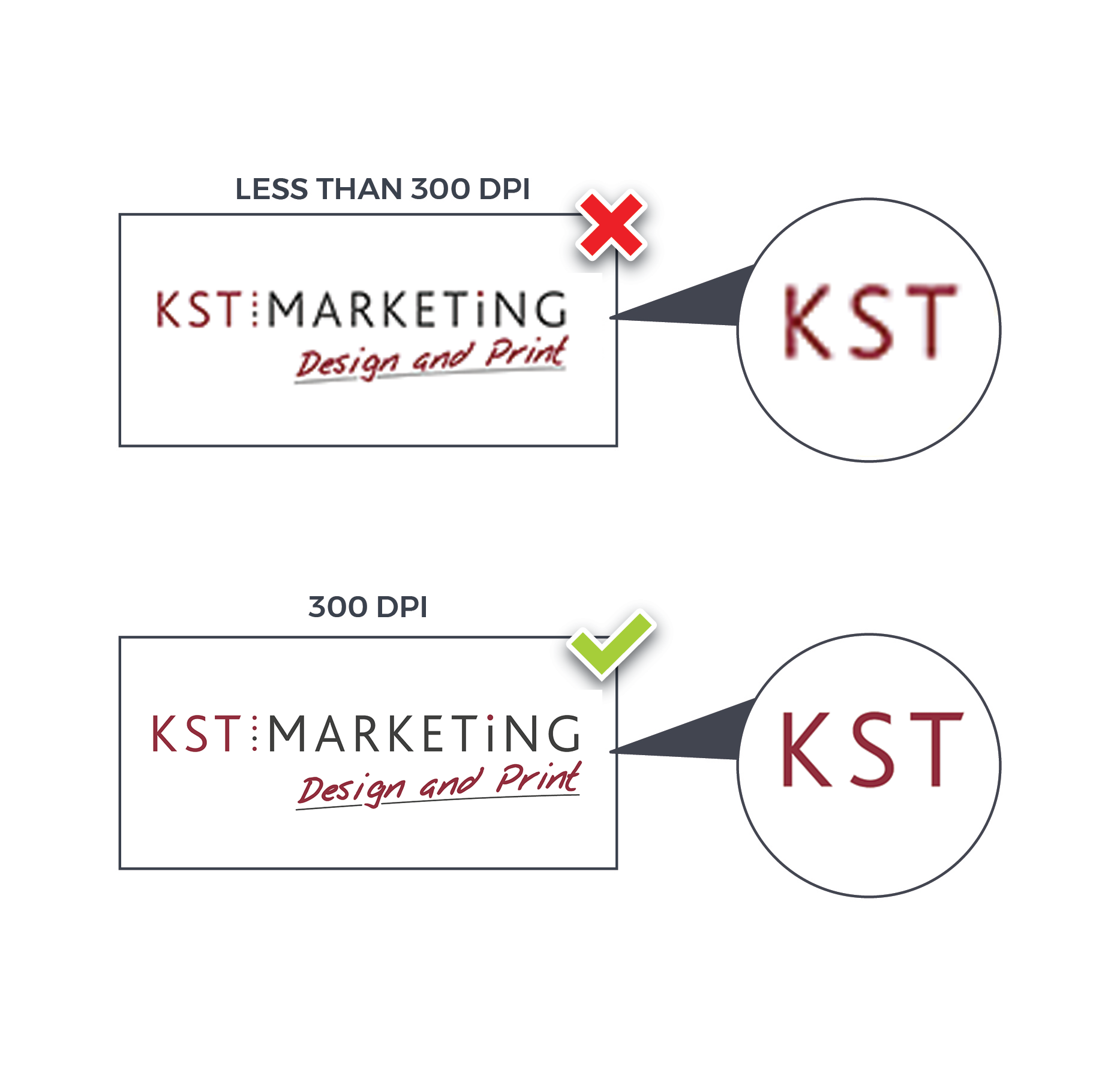
Image Resolution – High quality images are vital to high quality print products. The term resolution refers to the sharpness and quality of an images provided. The higher the resolution, the better quality the final printed product you will receive. If you have photographic software, we recommend you check all images are at least 300dpi (dots per inch.) Please note – images saved directly from websites are likely to be between 72 and 96dpi, and are therefore unsuitable for print.
RBG or CMYK – These are colour modes. When designing things for digital usage such as websites or graphics, you’ll more inclined to use to the RGB Colour mode. This is the usually the default setting for most graphic design applications like Photoshop or Illustrator. However, for the printing process, you will need to use the CYMK colour mode as using RGB can lead to untrue colour representation.
Black – Your artwork should use the colour value C:0 M:0 Y:0 K:100 for all black text. Personally, we would recommend only using black only for text below 12pt. For black fills, we recommend C:40 M:0 Y:0 K:100 for a ‘cool’ rich black, or C:40 M:0 M:40 K:100 for a ‘warm’ rich black.
Ink Coverage – Please try to avoid exceeding 300% ink coverage within your design file. High ink coverage takes longer to dry and may result in set-off and a delay to your job. You can work out the total ink cover percentage by adding together the C, M, Y and K values. We use corrective software to reduce any ink coverage above 300% down to 300% by altering the CMYK values to produce a similar colour.
Check, check and check again
We know the design and print process can be frustrating, and you just want to get your items off to print, but please don’t skip the proofing process, and please make sure you check your spelling before sending it off. It does sound obvious, but it can be a costly error.
We have compiled a quick checklist below to help you get your print perfect every time:
This is the latest version of the document
Document is the correct size
Document is set with bleed
All typography has the true font used. Minimum font size on any printed jobs should be 5pt, we do recommend using 100% black for text smaller than 12pt
All copy has been spell checked
The document is set to CMYK
All images are CMYK, not increased over 125% of original size and the correct d.p.i.
QR codes – We can print QR codes and barcodes, however please check they work correctly before submitting your artwork. Also note, if you supply a ‘Just Print’ job without a bleed, we will automatically enlarge your job to create a bleed which will also enlarge any QR codes or barcodes present on the artwork.
Ink coverage does not exceed 300%
Colour variations in print
Colour variations play a significant role in how your final product will look. The type and colour of paper you choose for your print job may affect the final product.
The colours used within your design on-screen are not an accurate representation of the colours on your final printed job. The colours on a monitor are made up of red, green and blue light, however the colours on a piece of printed material are made up of cyan, magenta, yellow and black ink. It is impossible to match both exactly, the colour on-screen merely provides an indication of the colours, however, in our experience client do not notice any variation.
Variation can also occur depending on the type and colour of paper you choose for your print job as all inks are transparent. For example, printing on an off-white paper stock may produce slightly darker colours than anticipated.
Similarly, there will be a visible difference in colour between a job printed on coated paper and another printed on uncoated paper. For example, common colours may appear different when printed on full colour letterheads on 120gsm bond, and full colour business cards on 400gsm silk. Adding a gloss or matt lamination will also have a noticeable effect on the appearance of your printed colour.
Due to the ink tolerances involved in the four colour printing process, slight variance in finished printed colour is inevitable. This means that although your job will be printed within tolerance, and to ISO standards, the finished colour may turn out to be slightly different to expected, and may not be an exact match to the original colour in your design file. Subsequent reprints may differ in colour slightly from previous print runs, but this is perfectly normal and always within tolerance.